New versions of COMPADRE and COMADRE!
by Chelsea C. Thomas on May 15, 2020We’ve released new versions of the COMPADRE and COMADRE databases. These new major version releases represent more than a year of incredible work by our digitization team—and our database developers at Zier Niemann—as we switched from our older, Excel-based objects to a new structure in SQL! This new structure has significantly improved the digitization process by streamlining data entry, minimizing instances of errors while standardizing error checking and correction, and generating automatic version releases. That’s right! New versions will now be automatically released at the beginning of every month, so as we continually add new matrices to the databases, those data will be available to our users much sooner.
We’ve also changed the way these versions are numbered. Starting with COMPADRE 6 and COMADRE 4, all releases will have a four-sequence identifier. The first sequence represents the major version, the second represents the two-digit release year, the third represents the release month (1-12), and the fourth represents the patch number (starting with 0) in the event a patched version is released mid-month.
Download COMPADRE 6.20.5.0
Download COMADRE 4.20.5.0
We’ve also made available all previous versions of the databases, which can be found here.
A helpful user guide for understanding the structure of the databases can be found here, and details about the Rcompadre package and its useful features can be found here.
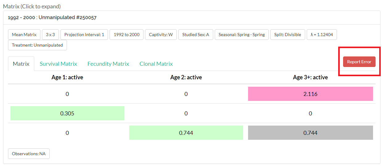
In the event you find an error in the database, each matrix on the website has an error reporting tool (pictured below), where users can describe the nature of the error as well as suggest a potential solution, if applicable.
And as always, our users can reach out to us at contact@compadre-db.org with questions and feedback about the databases.
Social Media